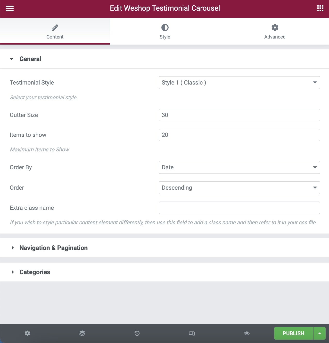
General
Testimonial Style: Select between 5 different carousel styles.
Gutter size: Select the size of the gutter between items.
Items to show: Select the maximum number of items you want to display.
Order By: Select the way you want to display your testimonial among Date, Last Modified Date, Number of comments, Title, Author, and Random.
Order: Select if you wish your order post to be Descending or Ascending.
Extra Class Name: If you wish to style a particular content element differently, then use this field to add a class name and then refer to it in your CSS file.
Navigation & Pagination
Loop: Select if you wish to use the loop or not.
Autoplay: Select if you wish to have autoplay or not.
Slideshow Speed: Type your slideshow speed in ms.
Auto Height: Select if you want smooth auto height.
Pause on Hover: If you select it, your Carousel will be paused on hover.
Pagination Visibility: Choose if you want your Carousel to have pagination or not.
Pagination Speed: Type your pagination speed in ms.
Categories
Exclude Posts: Type the post ids you want to exclude separated by comma ( , ).
Testimonial Categories: Select all or multiple categories.
Include Specific Posts: Type the post ids you want to include separated by comma ( , ). If you define specific post ids, Exclude Posts and Categories will have no effect.
Styles and Titles
Alignment: Pick the title alignment.
Show Item Title: Select if you need to display the item title.
Title Tag: Select your Testimonial Title Tag for SEO.
Title Size/Typography: Select your Testimonial Title size and typography, defined in Theme Options – Typography Options.
Text Style: Select the text size.
Show Featured Image: Enable or disable feature image visibility.
Shadow: Select if you prefer shadow in the element.
Border Radius: Select the border radius.
You can also discover the Testimonial Element – Elementor.