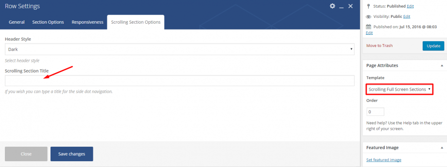
This is another simple and impressive effect that Anemos offers. The only thing you need to do is to select the Scrolling Full Screen Sections template from the Page Attributes and create the rows you want via the Visual Composer. Each one of these rows will be full screen with middle content.
Last but not least, you are able to select the Header Type (dark or light) you need in each one of your rows and define the name for these in the Scrolling Section Title field. Then, you will have them beside the dots, in the navigation. See the screenshot below.
It is worth noting that the Full Page Scrolling is based on the fullPage.js, it is a special feature with some restrictions. For example, you are not able to use it on every design especially if you have rows with full content as these rows will not fit properly on small screens. Of course, you can use the responsive options in the columns to have different content on devices than desktops but you must not overdo with your content when you use the Full Page Scrolling.

