Our customers’ feedback and need is always one of our priorities. So, in Crocal, we created a brand new custom element concerning contact form. You are able to stylish your contact form as you wish. Amazing, isn’t it?
To be more specific, there are two elements for the Contact Form 7.
- Contact Form 7 (classic)
- Custom Contact Form 7 (new)

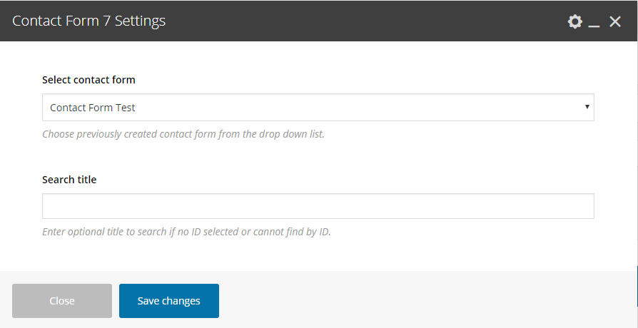
1. Contact Form 7
As usual, you select the contact form you have created under Contact > Contact Forms.
With this element, you can simply use any Contact Form 7 you’ve created. When using the Contact Form, the default layout is to have one field per row. However, you can have multiple fields with different styles in the same row by adding some HTML markup. Check the examples below and have in mind that you can combine anything you need:
With Columns One Third with Round fields
<div class="eut-form eut-fields-round eut-align-center">
<div class="eut-fields-wrapper">
<div class="eut-one-third"> [text* your-name placeholder "Your Name (required)"]</div>
<div class="eut-one-third">[email* your-email placeholder "Your Email (required)"]</div>
<div class="eut-one-third eut-last-column">[text your-subject placeholder "Subject"]</div>
<div>[textarea your-message placeholder "Your message"]</div>
<div>[submit class:eut-round "Send your message"]</div>
</div>
</div>
Vertical Newsletter Form Type
<div class="eut-form eut-fields-grey-bg eut-fields-extra-round eut-align-center">
<div class="eut-fields-wrapper">
<div>[text* your-name placeholder "Your Name (required)"]</div>
<div>[email* your-email placeholder "Your Email (required)"]</div>
<div>[submit class:eut-extra-round "Send your message"]</div>
</div>
</div>
Underline Style Contact Form
<div class="eut-form eut-underline">
<div class="eut-fields-wrapper">
<div>[text* your-name placeholder "Your Name (required)"]</div>
<div>[email* your-email placeholder "Your Email (required)"]</div>
<div>[text your-subject placeholder "Subject"]</div>
<div>[textarea your-message placeholder "Your message"]</div>
<div>[submit "Send your message"]</div>
</div>
</div>
Contact Form with Icons and Columns
<div class="eut-form">
<div class="eut-fields-wrapper">
<div class="eut-one-third eut-with-icon"><i class="fa fa-user"></i>[text your-name placeholder "Your Name"]</div>
<div class="eut-one-third eut-with-icon"><i class="fa fa-envelope"></i>[email* your-email placeholder "Your Email (required)"]</div>
<div class="eut-one-third eut-with-icon eut-last-column"><i class="fa fa-pencil"></i>[text your-subject placeholder "Subject"]</div>
<div>[textarea your-message]</div>
<div class="eut-align-center">[submit "Send your message"]</div>
</div>
</div>
Horizontal Newsletter
<div class="eut-fields-white-bg">
<div class="eut-fields-wrapper">
<div class="eut-one-third"> [text* your-name placeholder "Your Name (required)"]</div>
<div class="eut-one-third">[email* your-email placeholder "Your Email (required)"]</div>
<div class="eut-one-third eut-last-column">[submit "Send your message"]</div>
</div>
</div>
2. Custom Contact Form 7
This is the new custom element, the functionality it’s the same but you can stylish it as you prefer.
To be more detailed, the options are the following:
General
First of all, you select which contact form you want to use. Then, you can enter the font size, select the shape, the fields background, the fields text color, fields placeholder color, the fields border and the fields border color of your inputs.
Focus
Here, you have the same options as above but it concerns the stylish of the inputs when you click on an input.
Button
At this field, you can select the type, the color, the size and the shape of your buttons.

Note that if you need columns layout, you still have to use HTML markup under Contact > Contact Forms where you create your forms. Just use the classes you can see in Contact Form 7 samples.