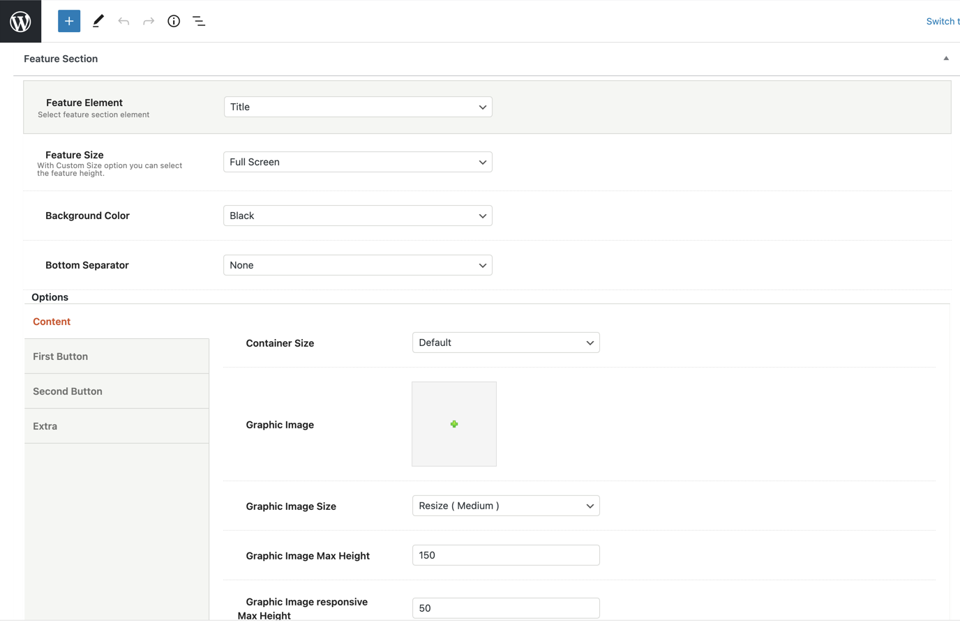
When the page title possibilities aren’t enough, simple or advanced users can take advantage that the feature title element offers. They can add a title and a description in custom height or full screen. Furthermore, the users have full control of font colors, semantic rules, font families, container and content sizes, alignments, animations, etc.
More precisely:
Feature Size: You can select the size of the feature title between Full Screen and Custom Size. With the Custom Size option, you have the possibility to adjust the feature height.
Background Color: You can choose one of the background colors given (transparent, gradient, dark, light, primary 1 to 6) or customize it by yourself by selecting the custom option.
Bottom Separator: A large variety is given to you to choose from. If you do not wish to use a separator you can select None.
Afterwards, you can define the options for the Content and the Extra.
Content tab
Container Size: You can select the size of your container between the default one and the large one.
Graphic Image: Here, you can upload your image.
Graphic Image Size: You can choose your graphic image size between Resize (Medium) and Full Size.
Graphic Image Max Height: Here, you can define the max height of your graphic image.
Graphic Image responsive Max Height: Here, you can define the max height of your graphic image for responsiveness.
Sub Heading: You can write your subheading.
Title: Type your title.
Description: Type your description.
Content Background Color: Here, you can select the background color of your content among None, Dark, Light, Primary 1 to 6, or Custom.
Sub Heading Color: You can choose your subheading color among Dark, Light, Primary 1 to 6, or Custom.
Title Color: You can choose your title color among Dark, Light, Primary 1 to 6, or Custom.
Description Color: Select among Dark, Light, Primary 1 to 6, or Custom.
Sub Heading Tag: Select the tag for your subheading.
Title Tag: Choose the tag for your title.
Description Tag: Choose the tag for your description.
Sub Heading Size/Typography: Select the size for your subheading.
Title Size/Typography: Select the size for your title.
Description Size/Typography: Select the size for your description.
Sub Heading Font Family: Select the font family for your subheading.
Title Font Family: Select the font family for your title.
Description Font Family: Select the font family for your description.
Content Size: Here, you can choose the size of your content among Large, Medium or Small.
Content Alignment: Select the alignment of your content from Left, Right or Center.
Content Position: A large variety of options is given to you for the position of your content.
Content Animation: Choose the animation you want to have for your content. You can select between eight options.
Extra
Scroll to Content: You can select between None, Arrow or Arrow & Text.
Scroll to Content Text: Type the text you want to display.
Scroll to Content Color: Select scroll to content color.
Extra Class: If you wish to style this element differently, then use this field to add a class name and then refer to it in your CSS file.

