If you need to change the order of your columns in a specific row of your Fildisi website, you can achieve it via a CSS snippet.
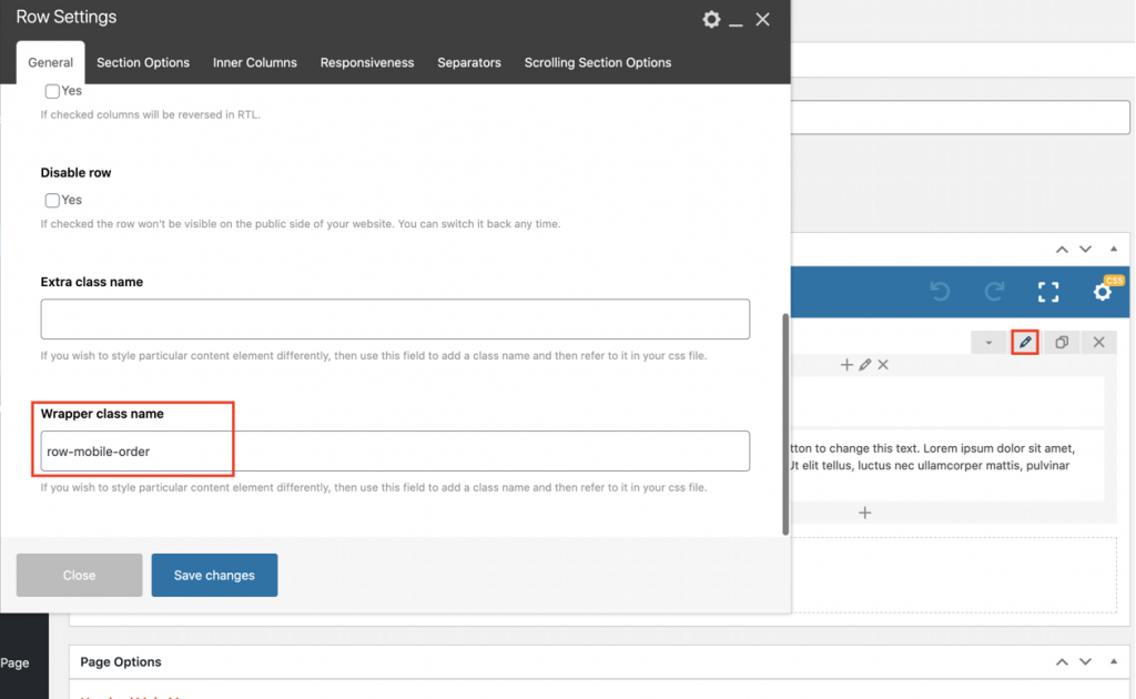
Firstly you need to add the “row-mobile-order” class name, for example, in your row under Wrapper class name.

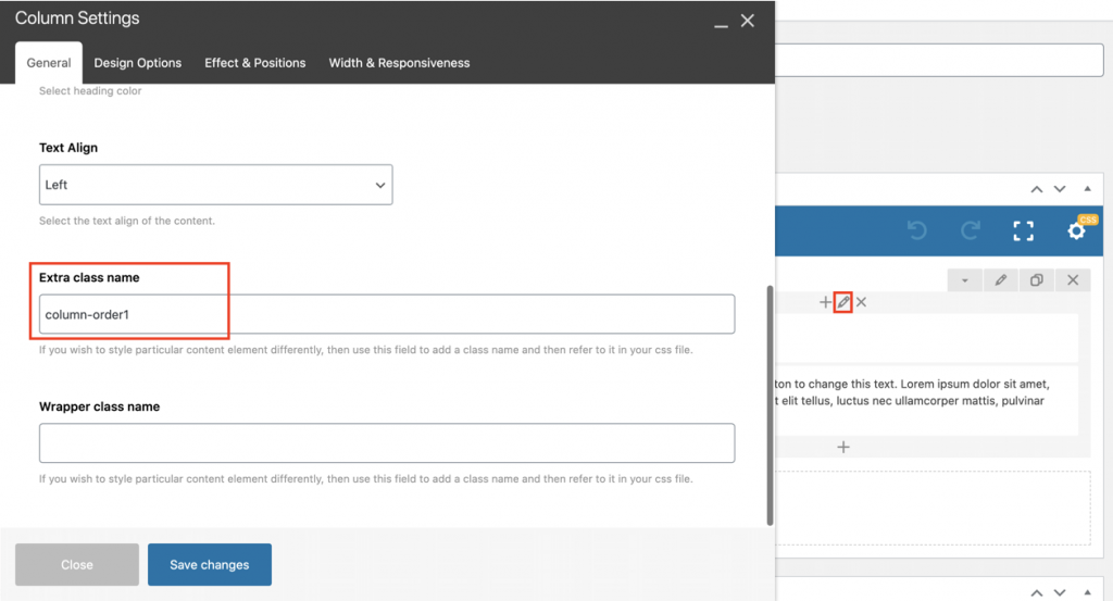
Also, add the “column-order1” class name in your column that you need to display first and the “column-order2” class name in the column that you need to display it below under Extra class name.

Then, use the following CSS snippet to switch the column order on mobile screen:
@media only screen and (max-width: 767px) {

.row-mobile-order {

display: flex;

flex-direction: column;

}

.column-order1 {

order: 1;

}

.column-order2 {

order: 2;

}

}
You can add it under Theme Options > CSS/JS Options or under Page Settings of your page. Class names can differ.
