Below you can see the image sizes from the functions.php file. If you need to save some server bandwidth we recommend uploading images of exactly the sizes listed below so as WordPress will not resize your images. However, this will not affect your site performance.
add_image_size( ‘fildisi-eut-large-rect-horizontal’, 1170, 658, true );
add_image_size( ‘fildisi-eut-small-square’, 560, 560, true );
add_image_size( ‘fildisi-eut-medium-square’, 900, 900, true );
add_image_size( ‘fildisi-eut-small-rect-horizontal’, 560, 420, true );
add_image_size( ‘fildisi-eut-small-rect-vertical’, 560, 745, true );
add_image_size( ‘fildisi-eut-medium-rect-vertical’, 840, 1120, true );
add_image_size( ‘fildisi-eut-medium-rect-horizontal’, 900, 675, true );
add_image_size( ‘fildisi-eut-fullscreen’, 1920, 1920, false );
Anyone can override the image sizes above via the child theme.
Control your Background Image Sizes
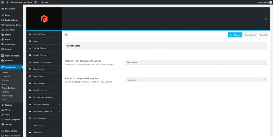
Another amazing feature in Fildisi is the way that anyone can control the sizes of the background images in the Feature Section and in the Row/Section background images under Theme Options > Media Sizes. There are 3 available options to select from:
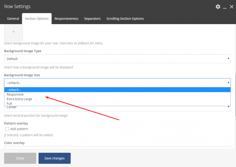
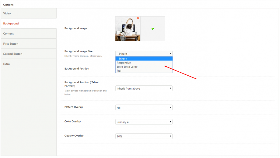
Responsive: Fildisi will use smaller images on smaller devices (screens) for better performance.
Extra extra Large: The resized image 1920×1920 will be used on any device and screen.
Full: For users that need to use an image as it is.
Last but not least, anyone can override these options separately in each Feature Section and in each Row/Section Background image usage. The following related screenshots illuminate these options.


