Here, we are going to describe the options you have to create a product page. Below, we explain each field one by one:
Product Options
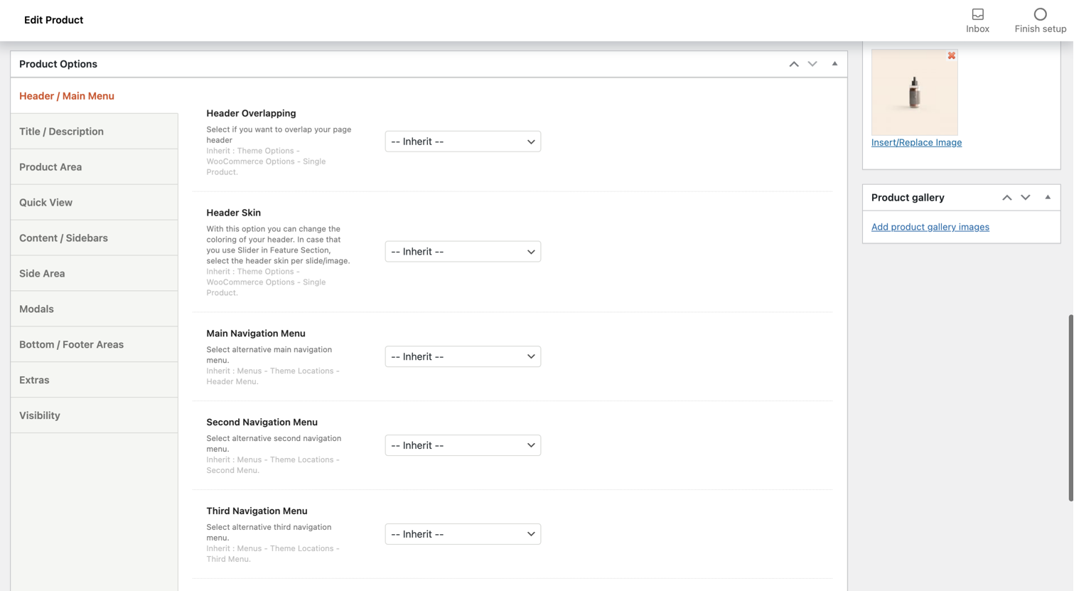
Header/Main Menu
Header overlapping: Select if you wish or not to overlap your page header. Of course, you can just leave the inherit option to get what exists under Theme Options > WooCommerce Options > Single Product.
Header Skin: With this option, you can change the coloring of your header from default, dark, light, and inherit (Theme Options > WooCommerce Options > Single Product). In case you use Slider in Feature Section, select the header skin per slide/image.
Main Navigation Menu: Here, you can select an alternative main navigation menu. You can choose from Footer Menu, Main Menu, or inherit (Menu > Theme Locations > Header Menu).
Second Navigation Menu: Here, you can select an alternative second navigation menu in case you are using a Header mode with 2 menu locations (under Theme Options > Theme & Header Options). You can choose among any of the available menus or inherit the global one (Menu > Theme Locations > Second Menu).
Third Navigation Menu: Here, you can select an alternative third navigation menu in case you are using a Header mode with 3 menu locations (under Theme Options > Theme & Header Options). You can choose among any of the available menus or inherit the global one (Menu > Theme Locations > Third Menu).
Responsive Navigation Menu: By this selection, you can select an alternative responsive navigation menu. You can choose among any of the available menus or inherit the global one (Menu > Theme Locations > Responsive Menu).
Sticky Header Type: With this option, you can just leave the inherit option (Theme Options > Theme & Header Options) or disable the Sticky Header.
Safe Button: With this option, you can select any of the available Safe Button area items or leave the global option (Theme Options > Theme & Header Options).
Responsive Header Overlapping: Here you can specify the behavior of the Responsive Header and if you need an overlapping with your content when the responsive header appears. Of course, you can just leave the inherit option (Theme Options > Header Options > Responsive Header Options).
Title/Description
Title/Description Visibility: Select visible if you wish your title and your description to be shown or hidden if you don’t want to show them.
Alternative Title: Add an alternative title if you don’t prefer the default title.
Description: Here, you can enter your product description. This is available only for the Custom Title.
Title Options: It’s the most important point for your product to be shown. You can select either the Custom title where the title has its own place above your Product’s short description or the Simple one where the title is included in the product area, just above the short description.
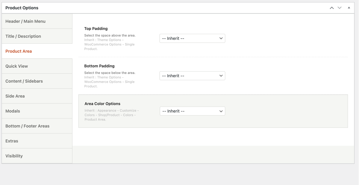
Product Area
Top Padding: Here, you can select the space you want to have above the area. You are able to choose from 1x, 2x, 3x, 4x, 5x, 6x, none, and inherit (Theme Options > WooCommerce Options > Single Product Settings).
Bottom Padding: Here, you can select the space you want to have below the area. You are able to choose from 1x, 2x, 3x, 4x, 5x, 6x, none, and inherit (Theme Options > WooCommerce Options > Single Product Settings).
Area Color Options: You can choose either Custom or Inherit (Appearance > Customize > Colors – Shop/Product > Colors – Product Area). Under the Custom option, you are able to select your background color, headings color, font color, link color, hover color, border color, button color, and button hover color. The available color options are 5 primary colors that you define under Appearance > Customize > Colors – Main Content and 9 predefined colors (green, orange, red, blue, aqua, purple, black, grey, and white).
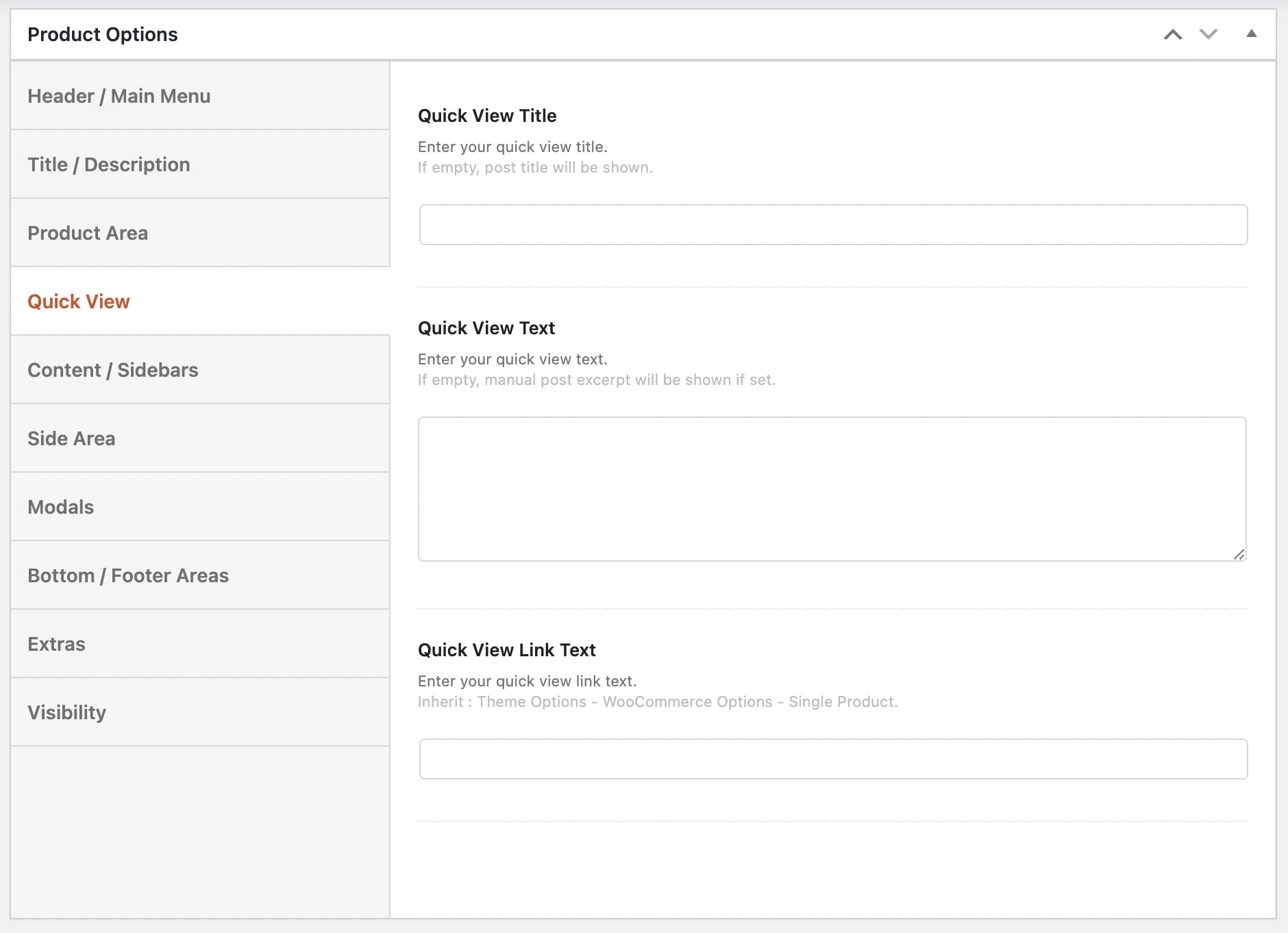
Quick View
Quick View Title: Enter a title for the Quick View
Quick View Text: Add the text you want to display on Quick View.
Quick View Link Text: Enter a text for the link on Quick View.
Content/Sidebars
Top Padding: Define the space above the content area. There are predefined options (1x-6x), you can set it to None to collapse the content area with the title or use a custom value (px, em, %, etc.). Otherwise, select the Inherit option for the global value under Theme Options.
Bottom Padding: Define the space below the content area. There are predefined options (1x-6x), you can set it to None to collapse the content area with the title or use a custom value (px, em, %, etc.). Otherwise, select the Inherit option for the global value under Theme Options.
Layout: Here, you can select the alignment of the page content and the sidebar. You can choose from full width, left sidebar, right sidebar or inherit (Theme Options > WooCommerce Options > Single Product Settings).
Sidebar: You can select any Widget Area you wish or leave the inherit option (Theme Options > WooCommerce Options > Single Product Settings).
Fixed Sidebar: If you select it, your sidebar will be fixed.
Content Width: Select the width of your content from small, medium, large, or inherit (Theme Options > WooCommerce Options > Single Product Settings).
Content Skin: Select the Skin of your content among Inherit, Dark, Light, or Custom
Inherit: Background from Theme Options – General Settings, Colors from Appearance > Customize > Colors – Main Content.
Side Area
Side Area Visibility: You can choose your side area to be visible or not. You also leave the inherit option here (Theme Options > WooCommerce Options > Single Product Settings).
Side Area Sidebar: Here, you can select which sidebar you want to use for your side area. You can select any Widget Area you wish or leave the inherit option (Theme Options > WooCommerce Options > Single Product Settings).
Modals
You can create your modals for this item.
Bottom/Footer Areas
Sticky Areas: Select if you want to make Bottom/Footer Areas Sticky.
Bottom Bar Area: You can select an area item for your Bottom Bar Area. You can choose any of your Area Items, set it to none or inherit it from Theme Options > Bottom/Footer Areas > Bottom Bar Area Item.
Footer Widgets Visibility: You can select the footer widgets to be visible or not. You can also choose to inherit (Theme Options > Bottom/Footer Areas > Footer Widgets Settings).
Footer Bar Visibility: You can select the footer bar to be visible or not. You can also choose to inherit (Theme Options > Bottom/Footer Areas > Footer Bar Settings).
Extras
Navigation Page: Select any page to be the Navigation Page.
Navigation Text: Add text for the navigation.
Theme Loader Visibility: Here, you can select if you wish your theme loader to be visible or not. You can also select inherit (Theme Options > General Settings).
Section Navigation Visibility: Select if you want to hide section navigation on some devices.
Theme Loader Visibility: Here, you can select if you wish your theme loader to be visible or not. You can also select inherit (Theme Options > General Settings).
Visibility
Here, you can select the elements you possibly need to disable. Elements to hide: Top bar, Sticky Header, Logo, Menus, Search, Contact form, Language Selector, Shopping Cart, Login, Social Icons, Breadcrumbs, the Content area, and Back to top.