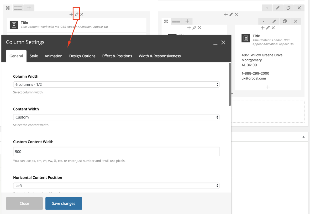
From the WP Admin dashboard, open the Page, Post, Portfolio or Product you need to edit, then select WP Bakery Backend Editor. Then click to open the Column Settings Modal and discover the available options there.
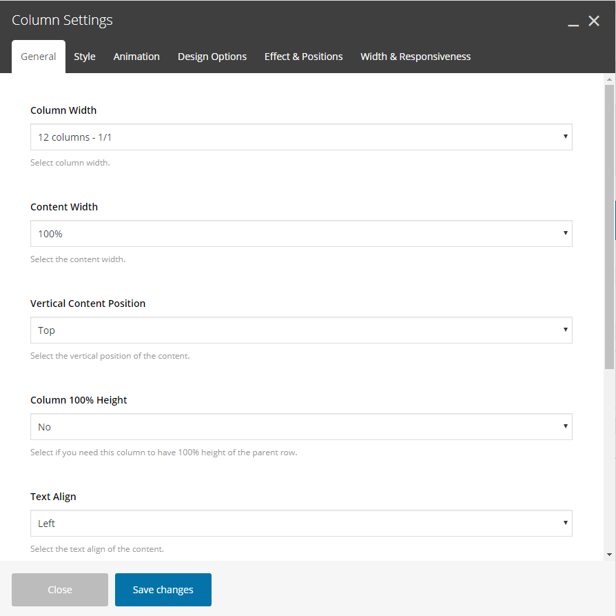
General
Column Width
Specify the column width.
Content Width
Specify in percentage the content width of the column.
Horizontal Content Position
Select the horizontal position of the content on this column- Left, Right, Center.
Vertical Content Position
Select the vertical position of the content on this column – Top, Middle, Bottom.
Column 100% Height
Select if you need this column to have 100% height of the parent row.
Text Align
Select the text align of the content on this column – Left, Right, Center.
Element ID
Enter element ID (Note: make sure it is unique and valid).
Extra Class Name
If you wish to style particular content element differently, then use this field to add a class name and then refer to it in your css file.
Wrapper Class Name
If you wish to style particular content element differently, then use this field to add a class name and then refer to it in your css file.
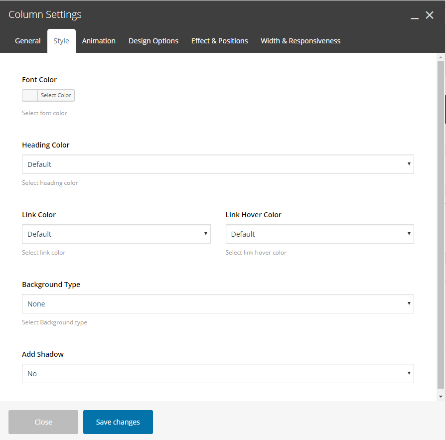
Style
Font Color
Choose the color for your fonts so texts will be readable. This will override your row color selection.
Heading Color
Set the color for your headings. Select among default, light, dark, 7 predefined or one of the 6 dynamic primary colors. This will override your row color selection.
Link Color
Set the link color for links on this column. This will override your row link color selection.
Link Hover Color
Set the link hover color for links on this column. This will override your row link hover color selection.
Background Type
Select the background for your column. You can select among: None, Color, Gradient Color, Image, Hosted video or YouTube video. These are exactly the same possibilities you have in the rows.
Add Shadow
Select among 3 different shadows (small, medium, large) for your column.
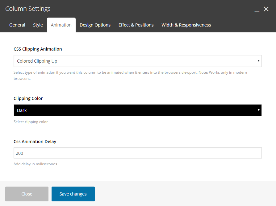
Animation
CSS Clipping Animation
Select type of animation if you want this column to be animated when it enters into the browsers viewport.
Clipping Color
If colored clipping is selected, you can define the color of this.
CSS Animation Delay
Add delay in milliseconds.
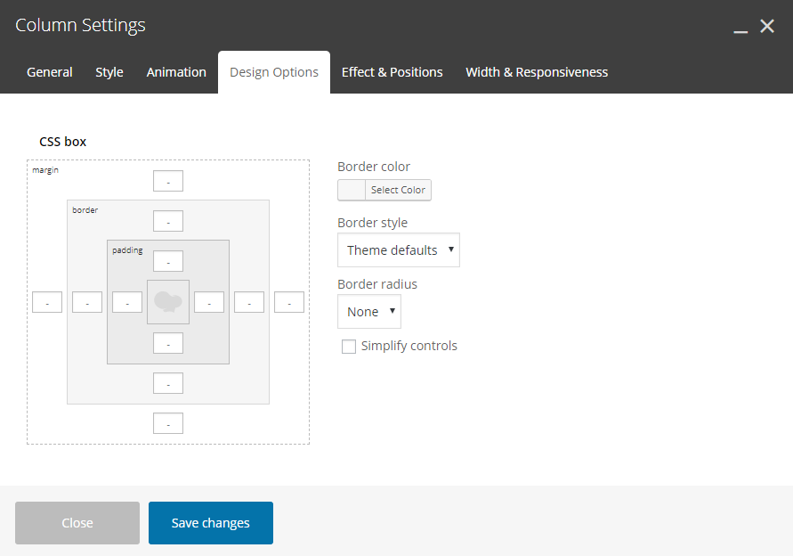
Design Options
Here you can set paddings, margins and borders for the columns content.
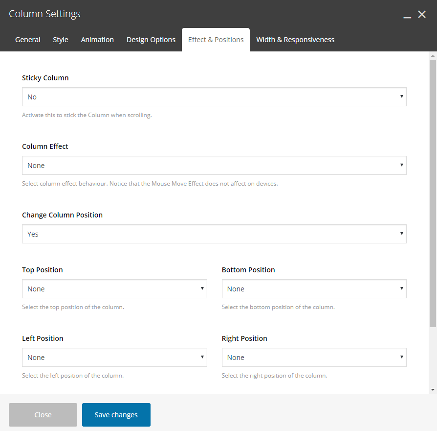
Effects and Positions
Sticky Column
Activate this to stick the Column when scrolling.
Sticky Top Offset
Enter a number in pixel to initial sticking position, if sticky column is activated.
Column Effect
Amazing and Unique feature. Select the effect for your column among the following:
- None
- Vertical Parallax
Change Columns Position
Select if you want to change the column position by setting YES here to get the following options:
1.Top Position
Define the top position for the column. Select among values 1x to 6x and -1x to -6x (consider that x is equal to 30 pixels).
With this method the spaces are being resized proportionally on devices.
2.Bottom Position
Define the bottom position for the column. Select among values 1x to 6x and -1x to -6x (consider that x is equal to 30 pixels).
With this method the spaces are being resized proportionally on devices.
3.Right Position
Define the right position for the column. Select among values 1x to 6x and -1x to -6x (consider that x is equal to 30 pixels).
With this method the spaces are being resized proportionally on devices.
4.Left Position
Define the left position for the column. Select among values 1x to 6x and -1x to -6x (consider that x is equal to 30 pixels).
With this method the spaces are being resized proportionally on devices.
5.Z Index
Specify the z-index value of this column to create amazing designs.
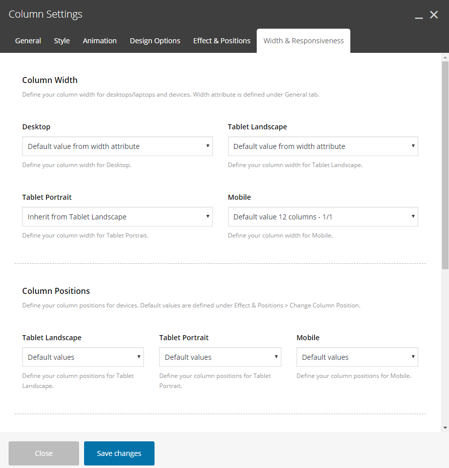
Width & Responsiveness
Column Width
Define your column width for desktops/laptops and devices. Width attribute is defined under General tab.
Desktop
Define your column width for Desktop. Default or Hide the available options here.
Tablet Landscape
Define your column width for Tablet Landscape. Default, Hide or specific Width the available options here.
Tablet Portrait
Define your column width for Tablet Portrait. Default, Hide or specific Width the available options here.
Mobile
Define your column width for Mobiles. Default, Hide or specific Width the available options here.
Content Width
Define your column content width for devices. Default is defined under General – Content Width.
Tablet Landscape
Define your content width for Tablet Landscape. Default or Reset the available Options.
Tablet Portrait
Define your content width for Tablet Portrait. Default or Reset the available Options.
Mobile
Define your content width for Mobile. Default or Reset the available Options.
Text Align
Define your text align for devices. Default values are defined under General – Text Align.
Tablet Landscape
Define your text align for Tablet Landscape. Default values, Left, Center or Right the available Options.
Tablet Portrait
Define your text align for Tablet Portrait. Default values, Left, Center or Right the available Options.
Mobile
Define your text align for Mobile. Default values, Left, Center or Right the available Options.
Column Order
Define the column order in which they appear in the grid for devices.
Tablet Landscape
Define your column order on Tablet Landscape. Default or a new column order the available options here.
Tablet Portrait
Define your column width on Tablet Portrait. Default or a new column order the available options here.
Mobile
Define your column width on Mobile. Default or a new column order the available options here.
Last but not least, you can locate and use exact the same options and effects in the inner Columns via the page builder of Crocal. Design with no restrictions!