Setting your Rows
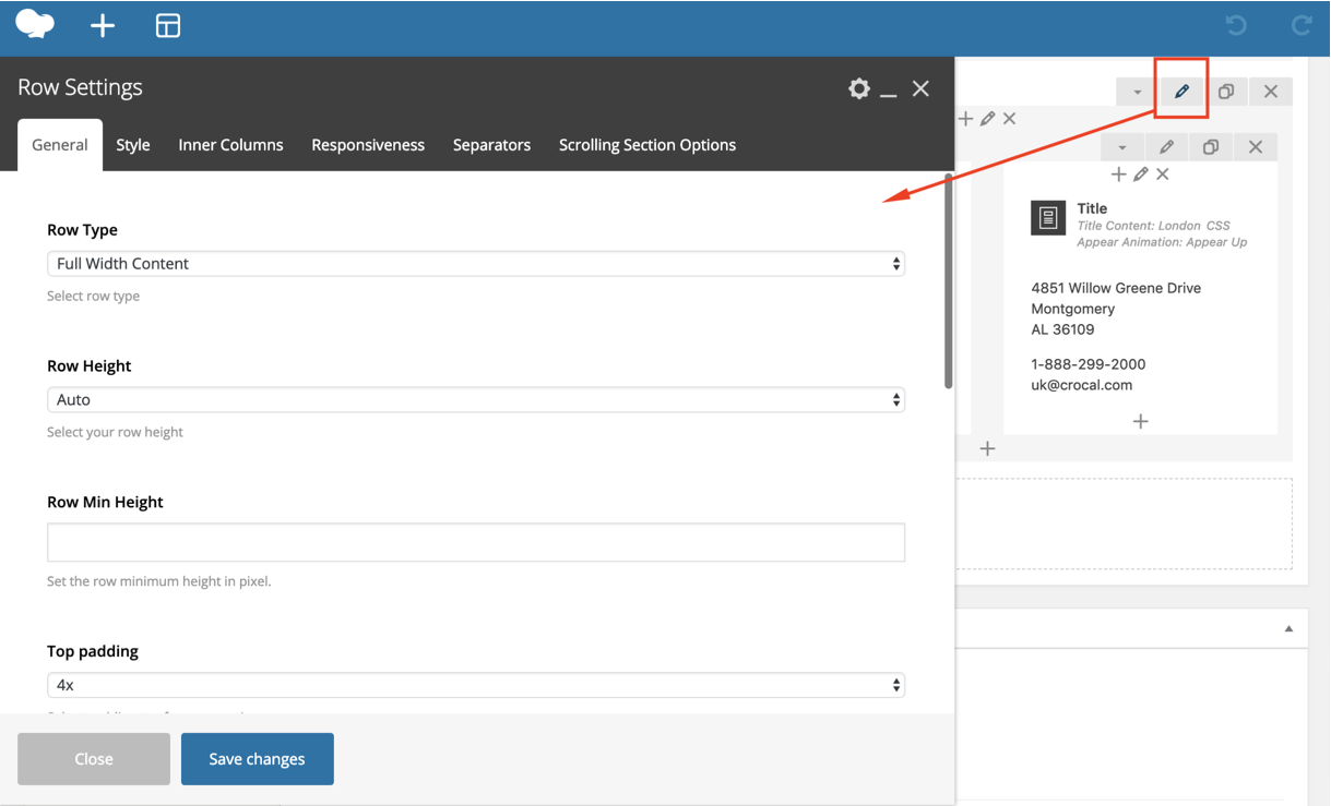
It is very important for the user to know the options Crocal offers in Rows in order to place correctly the elements given. From the WP Admin dashboard, open the Page, Post, Portfolio or Product you need to edit, then select WP Bakery Backend Editor. Then open the Row Settings Modal and discover the available settings.
Options are plenty; let’s have a look:
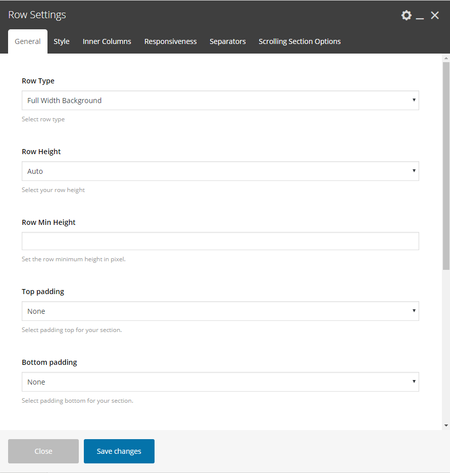
General
Row Type
Select among 3 different row types.
- Full Width Background – the background color will be stretched, this is the default option.
- Full Width Content– the content of this row will be stretched and not just the background.
- Container Width – the background color will have the container width.
Row Height
Specify the Height for your row. Select among Auto (height based on the content of the row), percentage or Window Height.
Row Min Height
Specify the Minimum Height for your row in pixel.
Top Padding
You can easily adjust the padding top of your section (row). Use the multipliers for better ratios on smaller screens or the custom field in px, em, %. If you enter just a number it will use pixels.
Bottom Padding
You can easily adjust the padding bottom of your section (row). Use the multipliers for better ratios on smaller screens or the custom field in px, em, %. If you enter just a number it will use pixels.
Bottom Margin
Set the margin-bottom of your section (row). You can use px, em, %, etc. or enter just number and it will use pixels.
Section ID
Give a name/ID for the section (row). This will be useful if you need an anchor menu or create a one page (see Anchor Menus in this documentation).
Extra Class
In case that you like to use one of your classes.
Wrapper Class Name
In case that you like to use one of your classes.
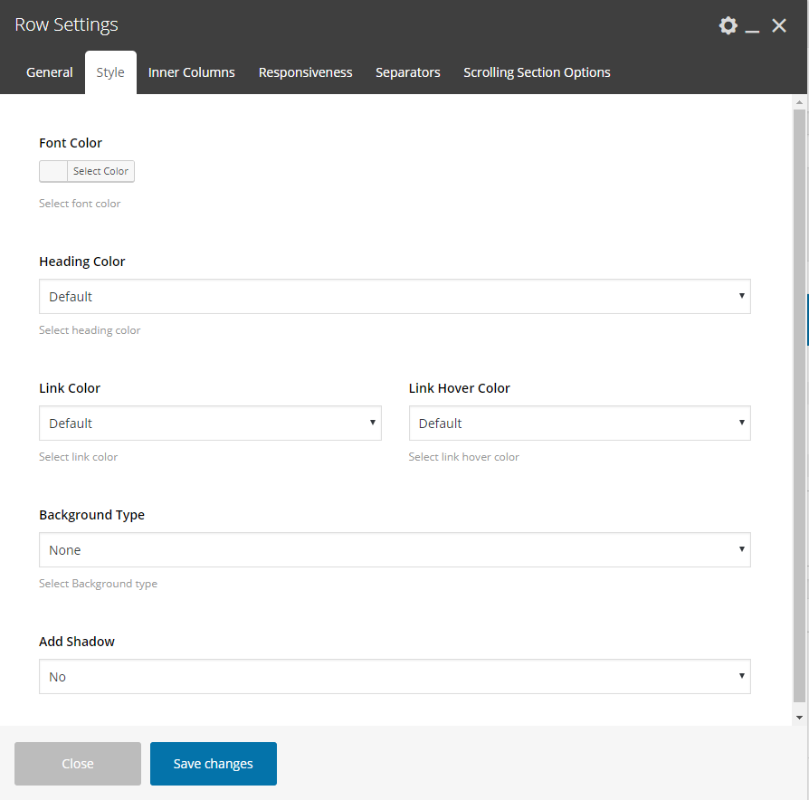
Style
Font Color
Choose the color for your fonts so texts will be readable.
Heading Color
Set the color for your headings. Select among default, light, dark, 7 predefined or one of the 6 dynamic primary colors.
Link Color
Set the link color for links on this row.
Link Hover Color
Set the link hover color for links on this row.
Background Type
Select the background for your section (row). You can select among: None, Color, Gradient Color, Image, Hosted video or YouTube video.
Add Shadow
Select among 3 different shadows (small, medium, large) for your row.
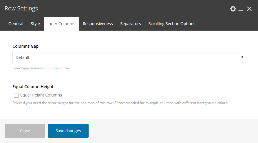
Inner Columns
Columns Gap
Here you are able to select the gap among columns in this row.
Equal Column Height
Select if you need the same height for the columns of this row. Recommended for multiple columns with different background colors.
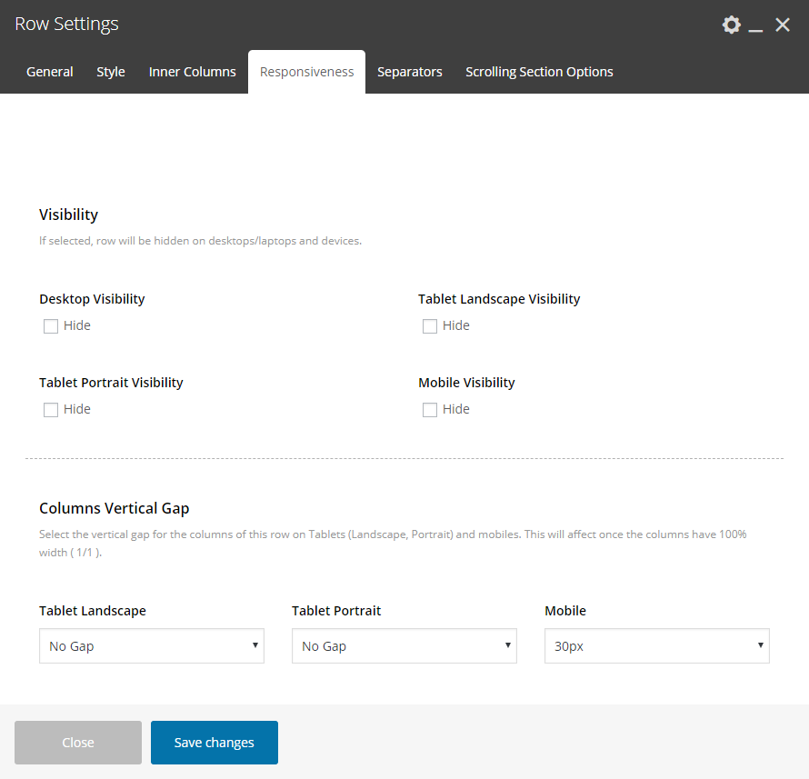
Responsiveness
Here you can hide any row/section you prefer on devices. You can hide rows on tablet, both landscape and portrait orientation, and on mobiles.
Visibility
If selected, row will be hidden on desktops/laptops and devices.
Desktop Visibility
If selected, the row will be hidden on desktops/laptops.
Tablet Landscape Visibility
If selected, the row will be hidden on tablet devices with landscape orientation.
Tablet Portrait Visibility
If selected, the row will be hidden on tablet devices with portrait orientation.
Mobile Visibility
If selected, the row will be hidden on mobile devices.
Columns Vertical Gap
Select the vertical gap for the columns of this row on Tablets (Landscape, Portrait) and mobiles. This will affect once the columns have 100% width ( 1/1 ).
Tablet Landscape
Define the Gap on Tablet Landscape.
Tablet Portrait
Define the Gap on Tablet Portrait.
Mobile
Define the Gap on Mobiles.
Equal Column Height
Select if you wish to keep or disable the Equal Column Height on devices. You get this option if you enable the option under Inner Columns – Equal Column Height.
Tablet Landscape
Keep the default option or disable the Equal Column Height on Tablet Landscape.
Tablet Portrait
Keep the default option or disable the Equal Column Height on Tablet Portrait.
Row Height
Select if you wish to keep or disable the Row height on devices. Inherits the values under General – Row Height. Auto is the height based on the content of the row, Window Height or a different percentage per device.
Tablet Landscape
Define the Row Height on Tablet Landscape.
Tablet Portrait
Define the Row Height on Tablet Portrait.
Mobile
Define the Row Height on Mobiles.
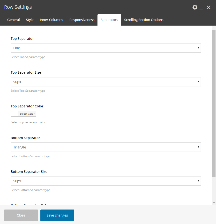
Separators
Top Separator
Select the separator you need for the top of your row. Then define size (percentage or pixels) and color.
Bottom Separator
Select the separator you need for the bottom of your row. Then define size (percentage or pixels) and color.
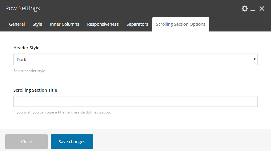
Scrolling Section Options
These options will take effect only if you use the Scrolling Full Screen Sections template.
Header Style
You can select the Header style, between Light and Dark, for this specific row.
Scrolling Section Title
Give a title for this row for the side dot navigation.
Last but not least, you can locate and use exact the same options and effects in the inner Rows via the page builder of Crocal. Design with no restrictions!