You will be amazed by the possibilities of this element. Firstly, you can define the height of the section, its background color and if you wish to place it above or below your header. Afterwards, you can set your preferences for the slider element which will really impress you. You can set your own slideshow speed, between the slides and for the slide in general, select if you wish pause on hover, choose your navigation button and your transition. Moreover you can select the slider effect among animated, parallax and none. Amazing, isn’t it?
More detailed:
Feature Size: You can select the size of the feature title between Full Screen and Custom Size. With the Custom Size option, you have the possibility to adjust the feature height.
Feature/Header Position: You have the option either the header to be shown above the feature section or below it. Header above feature or Header below Feature.
Background Color: You can choose one of the background colors given (transparent, gradient, dark, light, primary 1 to 6) or customize it by yourself by selecting the custom option.
Bottom Separator: A large variety is given to you to choose among. If you do not wish to use a separator you can select None.
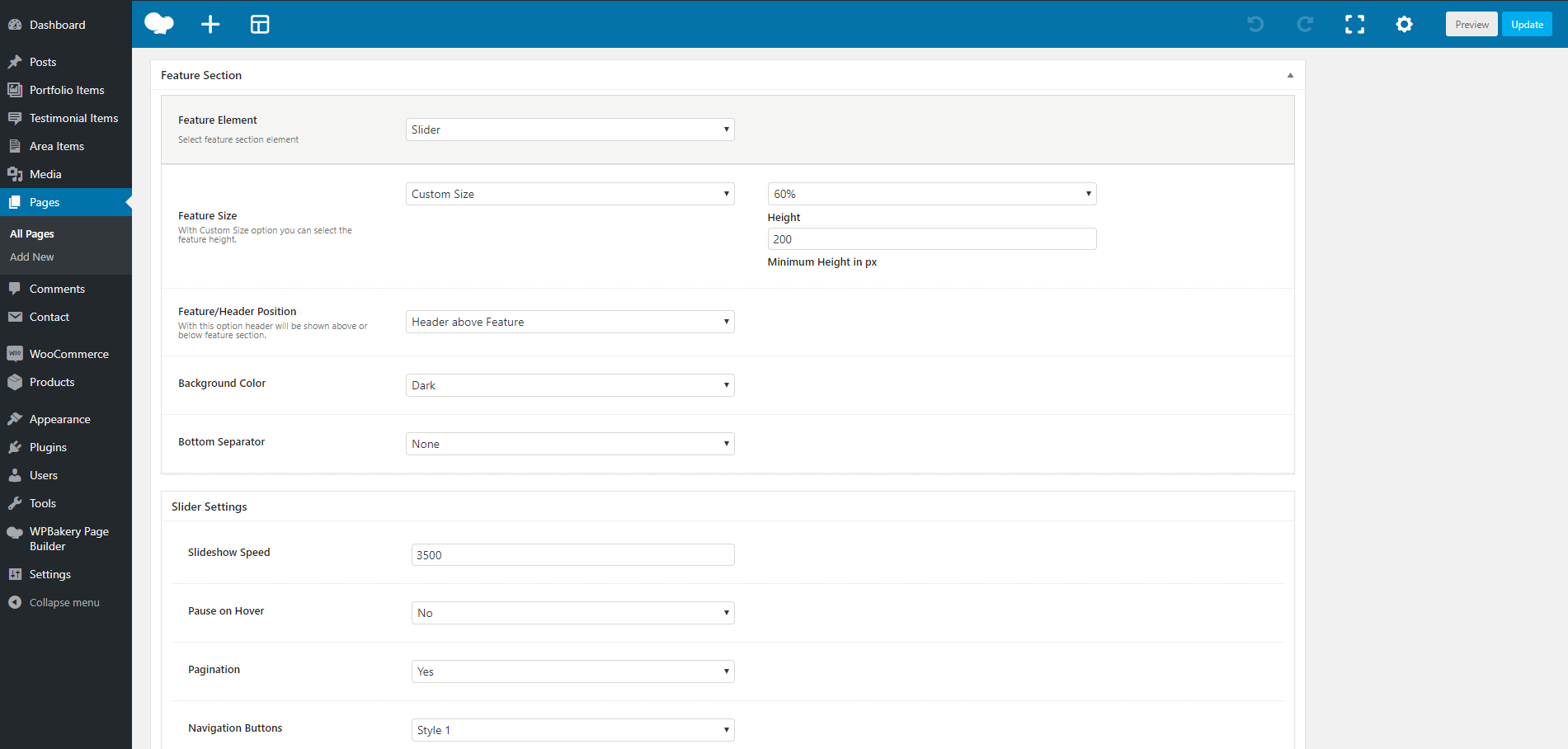
Afterwards, you can define the settings for your Slider.
Slider Settings
Slideshow Speed: Here, you can define the speed of your slideshow.
Pause on Hover: Select if you wish to have a pause while you hover on the image or not.
Pagination: Choose if you want pagination or not.
Navigation Buttons: Here, you can select the navigation of your buttons.
Transition: Choose the transition among Slide, Fade, Back Slide or Go Down.
Slider Effect: Select the effect you want to have. The options are Animated, Classic Parallax, Advanced Parallax, Fixed Section and None.
Add Slides: Here, you can insert images to the slider.
Add Post Slides: Here, you can insert posts to the slider.
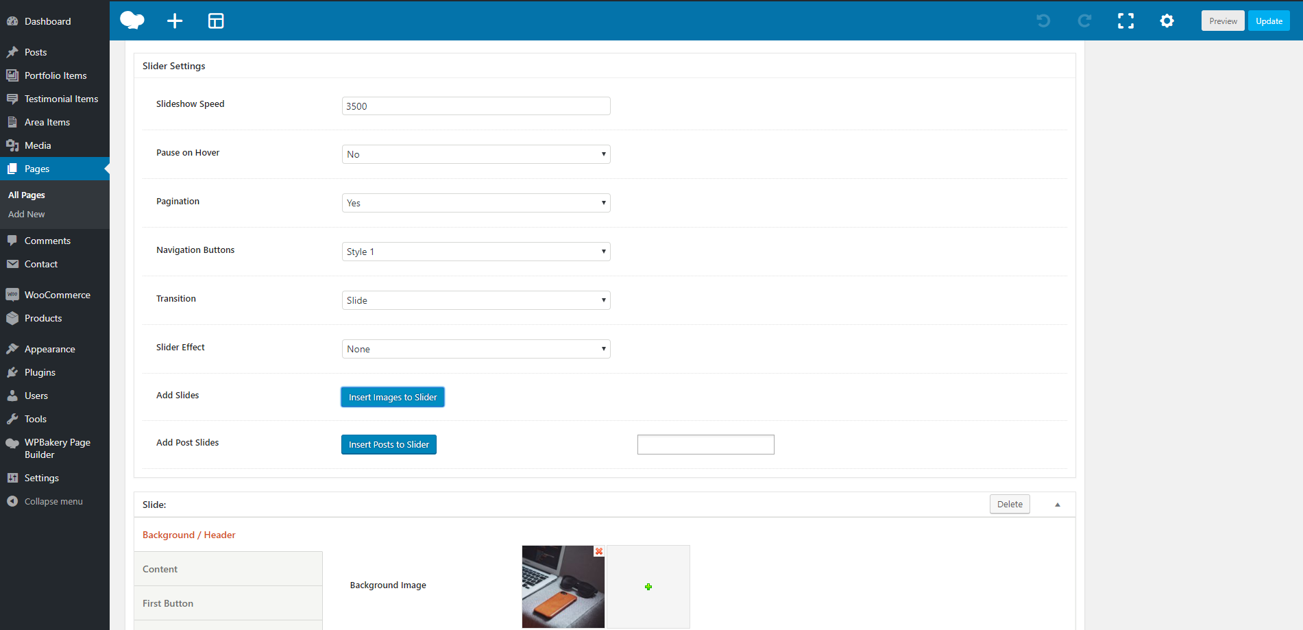
Once, you will add Slides or Post Slides in your slider, more options will appear, other for the Slides and other for the Post Slides. To be more precise, have a closer look to the options offered.
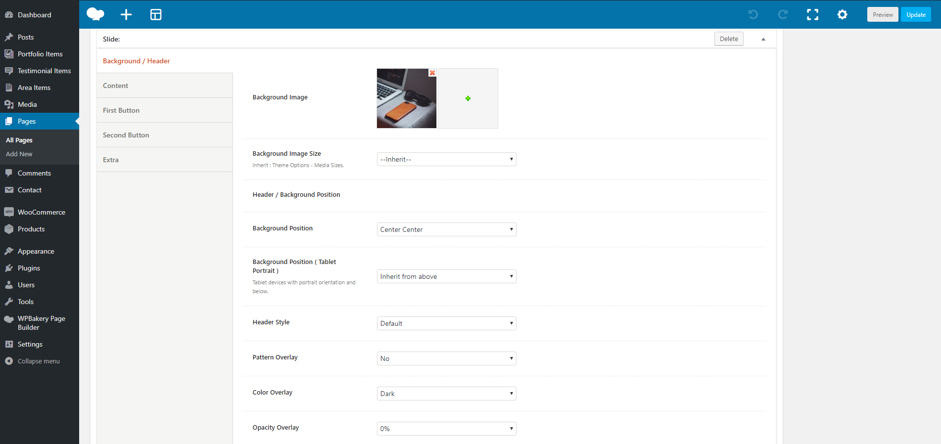
Slide Options
Background Image: Here, you can upload your background image.
Background Image Size: You can select the size of your background image among Responsive, Extra Extra Large, Full or Inherit. If you choose Inherit you can define it under Theme Options – Media Sizes.
Background Position: Select the position of your background. A lot of options are given.
Background Position (Tablet Portrait): It concerns tablet devices with portrait orientation and below.
Header Style: Define the style of your header among Dark, Light and Default.
Pattern Overlay: Select if you wish to have a pattern overlay or not.
Color Overlay: You can choose your color overlay among Gradient, Dark, Light, Primary 1 to 6 or Custom.
Opacity Overlay: Here, you can define the opacity of your overlay in %.
Content Slide
Container Size: You can select the size of your container between the default one and the large one.
Graphic Image: Here, you can upload your image.
Graphic Image Size: You can choose your graphic image size between Resize (Medium) and Full Size.
Graphic Image Max Height: Here, you can define the max height of your graphic image.
Graphic Image responsive Max Height: Here, you can define the max height of your graphic image for the responsiveness.
Sub Heading: You can write your sub heading.
Title: Type your title.
Description: Type your description.
Content Background Color: Here, you can select the background color of your content among None, Dark, Light, Primary 1 to 6 or Custom.
Sub Heading Color: You can choose your subheading color among Dark, Light, Primary 1 to 6 or Custom.
Title Color: You can choose your title color among Dark, Light, Primary 1 to 6 or Custom.
Description Color: Select among Dark, Light, Primary 1 to 6 or Custom.
Sub Heading Tag: Select the tag for your sub heading.
Title Tag: Choose the tag for your title.
Description Tag: Choose the tag for your description.
Sub Heading Font Family: Select the font family for your sub heading.
Title Font Family: Select the font family for your title.
Description Font Family: Select the font family for your description.
Content Size: Here, you can choose the size of your content among Large, Medium or Small.
Content Alignment: Select the alignment of your content from Left, Right or Center.
Content Position: A large variety of options is given to you for the position of your content.
Content Animation: Choose the animation you want to have for your content. You can select eight options.
First and second Button
Button Text: Here, you can enter the text for your button.
Button URL: Enter the URL in which your button will be direct to.
Button Target: Select if you want the button to be opened in a new page or in the same page.
Button Type: Select if you wish to have a Simple, a Outline or a Gradient type.
Button Color: Choose the color of your button.
Button Hover Color: Select the hover color of your button.
Button Size: You can choose the size of your button among Extra Small, Small, Medium, Large or Extra Large.
Button Shape: Here, you can select the shape you wish for your button. Your options are Square, Round and Extra Round.
Button Shadow: Select the shadow of your button among Small, Medium, Large or None.
Button Class: Type the class of your button.
Extra
Scroll to Content: You can select among None, Arrow or Text.
Post Slides Options
The Background Image can still be used instead of your Feature Image.
Background Image: Here, you can upload your background image.
Background Image Size: You can select the size of your background image among Responsive, Extra Extra Large, Full or Inherit. If you choose Inherit you can define it under Theme Options – Media Sizes.
Background Position: Select the position of your background. A lot of options are given.
Background Position (Tablet Portrait): It concerns tablet devices with portrait orientation and below.
Header Style: Define the style of your header among Dark, Light and Default.
Pattern Overlay: Select if you wish to have a pattern overlay or not.
Color Overlay: You can choose your color overlay among Gradient, Dark, Light, Primary 1 to 6 or Custom.
Opacity Overlay: Here, you can define the opacity of your overlay in %.
Content Post Slide
Container Size: You can select the size of your container between the default one and the large one.
Content Background Color: Here, you can select the background color of your content among None, Dark, Light, Primary 1 to 6 or Custom.
Post Meta Color: You can choose your post meta color among Dark, Light, Primary 1 to 6 or Custom.
Post Title Color: You can choose your post title color among Dark, Light, Primary 1 to 6 or Custom.
Post Description Color: Select among Dark, Light, Primary 1 to 6 or Custom.
Post Meta Tag: Select the tag for your post.
Post Title Tag: Choose the tag for your post title.
Post Description Tag: Choose the tag for your post description.
Post Meta Font Family: Select the font family for your post.
Post Title Font Family: Select the font family for your post title.
Post Description Font Family: Select the font family for your post description.
Content Size: Here, you can choose the size of your content among Large, Medium or Small.
Content Alignment: Select the alignment of your content from Left, Right or Center.
Content Position: A large variety of options is given to you for the position of your content.
Content Animation: Choose the animation you want to have for your content. You can select eight options.
Extra
Scroll to Content: You can select among None, Arrow or Text.