WeShop comes with the Elementor WordPress Website Builder, a drag and drop page builder with built-in responsive options.
As you can easily see, WeShop’s elements are specially handmade for the theme’s preferences and they harmoniously use the amazing visual interface of the composer. That means you will not find just one Elementor copy with its elements in WeShop. If you install the WeShop Elementor Extension by Euthemians, you will be able to use more than 50 handmade widgets.
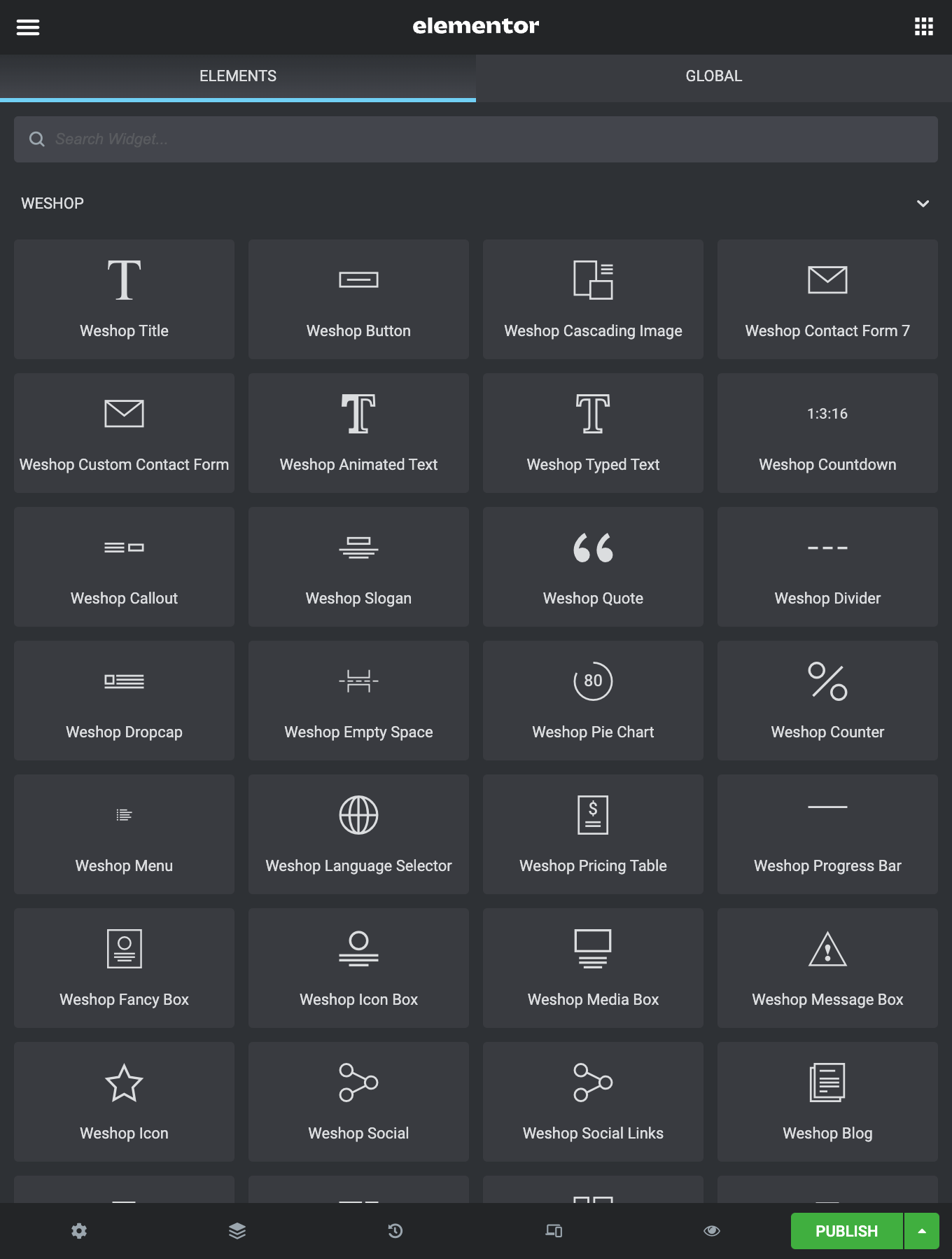
Let’s take a brief look at the elements:
WeShop Title
This element will create a title that you can use to introduce a new section. You can set the size, alignment, font options, animation and the line-style(if you use a line).
WeShop Button
The button element is an easy way to add a styled button to your page. Just choose the appropriate size, type, shape, color, and animation. Finally, fill out the other fields (text, link, hover, shadow) and here you are.
WeShop Cascading Image
Create cascading image style. Add your images and place them using X and Y offset.
WeShop Contact Form 7
With this element, you can simply use any Contact Form 7 you’ve created.
WeShop Custom Contact Form
Style your Contact Form as you need. Choose size, shapes, colors for input fields and buttons.
WeShop Animated Text
Create your own Animated Text. Style it and choose Animation Style between Lines, Words, and Characters.
WeShop Typed Text
Create a Typed Text by choosing prefix, suffix, size, color, and animation options.
WeShop Counter
This element can be used to quickly create animations that display numerical data in a more interesting way. You can set colors, icon, title, and more.
WeShop Countdown
Place the countdown element and style it by selecting its style, numbers size, text size, numbers color, text color, and many more.
WeShop Callout
With the call-out element you’re able to choose your preferred style, give a title, your text, button and off you go.
WeShop Slogan
The slogan element creates a slogan with two buttons. Simply add title, subtitle, text, line-style and buttons (1 or 2).
WeShop Quote
Add your text, set the animation you like and your quote text is ready to be published.
WeShop Divider
With this element, you can create a divider (line, double line, dashed line, or back to top) to better separate your elements and sections. Additionally, you can split your pages by using full-width dividers.
WeShop Dropcap
Two styles for dropcaps. Add your text, choose your style, set the animation and save.
WeShop Empty Space
Add a Blank space with the height you prefer.
WeShop Pie Chart
With this element, you can create appealing pie charts with multiple options.
WeShop Menu
Add a menu to your content. Choose orientation, type, font type & size, and alignment.
WeShop Language Selector
Place the language selector and select its style (Dropdown, List), alignment, bottom margin, and CSS animation.
WeShop Pricing Table
Pricing tables are used to display any subscription options in your columns. Create the tables you wish and add your data.
WeShop Progress Bar
This element creates horizontal bars that get animated in accord with the percent given; the best way to show your skills in a visual way with multiple styles.
WeShop Icon Box
Another element with multiple options. Firstly, select the icon type, size, and icon alignment. Secondly, you can use any font from icon libraries or upload an SVG icon! Give title, text, link, align, icon color, icon shape, advanced hover. Then, add text and link if you like and enjoy it!
WeShop Fancy Box
We would say that it is an advanced icon box. However, you can have background color and hover background on the whole box area. Select any font from Font libraries, specify the box shadow and the link target. Give title, text, text style, size, and icon. Enjoy it!
WeShop Media Box
Media for WeShop means image, video, or map. Combine one of these with title, text, link and you’re ready!
WeShop Message Box
With this element, you create a message text with an icon and background color.
WeShop Icon
Just like the Icon Box but with only a single icon and multiple options. Use any icon from Icon Libraries or upload SVG, select the icon size, shape, colors, alignment, and set the link.
WeShop Social
With this element, you can simply add social media icons anywhere on your pages in multiple styles.
WeShop Social Links
You can add social networking links and style them by selecting their size, color, shape, and alignment.
WeShop Blog elements
The Blog element is undoubtedly one of the most important elements which most users will probably use. Based on that fact, WeShop really offers multiple options for this element in Elementor.
There are three separate elements to showcase your posts, Grid and Carousel layout. For more details check the WeShop Blog element, WeShop Blog Carousel element, and WeShop Blog Leader element related articles.
Select between the Blog Mode, define the number of posts, filters, categories, and many more.
WeShop Portfolio elements
Other famous elements for any site are the Portfolio elements in order to showcase your work online. Based on that fact, WeShop really offers three elements to showcase your portfolio items in Elementor. The WeShop Portfolio element, the WeShop Portfolio Carousel element, and the WeShop Portfolio Broken.
WeShop Testimonial elements
This element creates a nice display of your testimonials items. Go Testimonial > Testimonial Items and create your testimonials. Afterwards, add the WeShop Testimonial element for Grid and Masonry mode or the WeShop Testimonial Carousel element for Carousel mode. Then, define the various settings like columns, styles, categories, pagination, and more.
WeShop Content Slider
In this element, you can add a slider of Posts, Portfolio items or Products with excerpt, button and many styling options.
WeShop List Title
The List Title element provides a beautiful list of Portfolio, Post, or Product items.
WeShop Single Image
Upload a single image and give the alignment, animation, link you wish. You can have Image, Image Link, Image popup, and popup video.
WeShop Image Text
With this shortcode, you can simply upload an image(with a video popup if you like), title, text, and button(any type).
WeShop Gallery
The Gallery element gives the option to select if images are from gallery or you will add images with different settings. It has 2 different modes for showing your images with various options. Grid and Masonry with multiple options for hovers, overlays, columns, and more. You can also select image size and effects.
WeShop Image Carousel
This element is like the WeShop Gallery element but on Carousel mode. First, select carousel type and add your images. Also, you can choose link type, image size, hover, overlay, navigation, and pagination options.
WeShop Gallery Broken
The Image Gallery Broken element offers 4 different broken layouts with hover & title options and image link options.
WeShop Slider
This element is not just a simple slider. Upload your images, select the navigation type and color. Set if you want autoplay, the slideshow speed, the image crop/resize! Don’t forget to set it to full-width element, it’s great!
WeShop Video
You can just add a video(YouTube, Vimeo), even full-width video.
WeShop Map
Give the Latitude/Longitude, set the map height and the zoom you wish for your map. You can have single or multiple points with your image markers or with theme dot icons in which you can also define the background color. Last but not least, you can keep or disable the custom style you may have created under Theme Options.
WeShop Team
This element takes in a quick profile for a team member/employee and formats it attractively. Add the information you wish, it’s so simple.
WeShop Split Content
In this element, you can combine image with text and button. All in one element with styling options and animation!