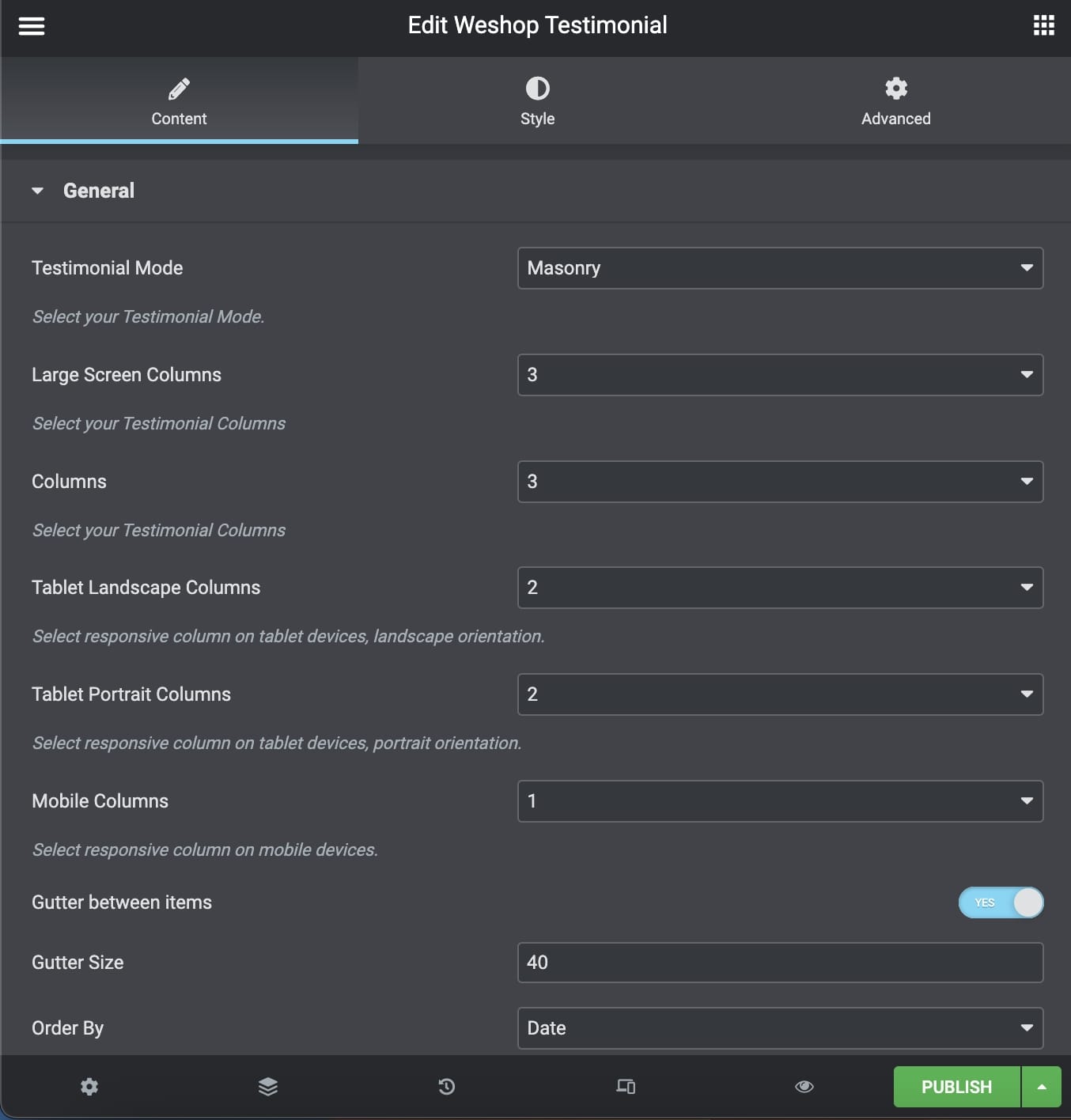
General
Testimonial Mode: Select between the Grid and Masonry portfolio mode.
Large Screen Columns: Select the testimonial columns you wish to have on large screens.
Columns: Select the number of columns you want to display.
Tablet Landscape Columns: Select the number of columns on tablet devices, in landscape orientation.
Tablet Portrait Columns: Select the number of columns on tablet devices, in portrait orientation.
Mobile Columns: Select the number of columns on mobile devices.
Gutter Between Items: Choose yes if you wish to add a gutter between your items.
Gutter Size: Choose the gutter size.
Order By: Select the way you want to display your testimonial among Date, Last Modified Date, Number of comments, Title, Author, and Random.
Order: Select if you wish your order post to be Descending or Ascending.
CSS Animation: Select your type of animation if you want this element to be animated when it enters into the browser’s viewport. Note: It works only in modern browsers.
Extra Class Name: If you wish to style a particular content element differently, then use this field to add a class name and then refer to it in your CSS file.
Element ID: Enter your element ID, just make sure that it is unique.
Pagination and Extras
Items per Page: Enter how many items per page you want to display.
Display Style: You can select among Show All, Pagination, Load More, and Infinite Scroll.
Categories
Exclude Posts: Type the post ids you want to exclude separated by comma ( , ).
Testimonial Categories: Select all or multiple categories.
Include Specific Posts: Type the post ids you want to include separated by comma ( , ). If you define specific post ids, Exclude Posts and Categories will have no effect.
Styles and Titles
Testimonial Style: Define the Testimonial Style.
Show Item Title: Select if you need to display the item title.
Title Tag: Select your Testimonial Title Tag for SEO.
Title Size/Typography: Select your Testimonial Title size and typography, defined in Theme Options – Typography Options.
Text Style: Select the text size.
Show Featured Image: Enable or disable feature image visibility.
Title Color: Select the color for the Title.
Text Color: Select the color for the Description and Text.
Background Color: Select the background color.
Shadow: Select if you prefer shadow in the element.
Border Radius: Select the border radius.
You can also discover the Testimonial Carousel Element – Elementor.